Projects
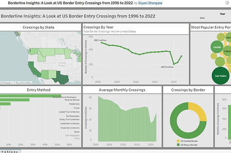
Borderline Insights: US Entry Data 1996-2022
This interactive Tableau dashboard was designed to provide a comprehensive overview of border entry crossings in the United States between 1996 and 2022.
The goal of the project is to:
-
Provide insights into US border entry trends over time
-
Identify the states with the highest number of crossings
-
Identify ports with the highest number of crossings
-
Identify the method used most for crossings
SQL was used to conduct the analysis in this project.
Dashboard: Tableau
Link to SQL Analysis (BigQuery): US Entry Data Analysis
Source: US Bureau of Transportation
_edited.jpg)
Unearthing Adidas 2021 US Sales Insights
This report, produced with R and R Studio, examines Adidas sales data to find key insights about two topics:
-
Sales performance of retailers in different regions.
-
Sales performance of product categories in different regions.
The report includes an analysis and recommendations based on the insights gained through analysis.

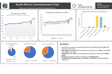
South Africa's Unemployment Crisis
This static dashboard and presentation were designed to shed light on the ongoing unemployment crisis in South Africa.
Using data from Stats SA's 2022 Q2 Quarterly Labor Force Survey, this analysis seeks to find insights on:
-
The change in South Africa's unemployment rate over time
-
Which races and genders are most affected by unemployment
-
Which regions are home to the most unemployed job seekers within the labor force
Microsoft Excel was used for all data analysis and visualisations.
The presentation was designed using Microsoft PowerPoint.